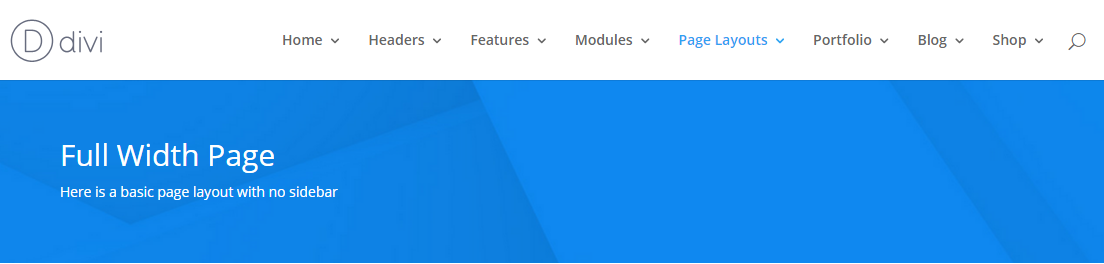
Media queries Media queries can be used to tell your browser what to do at certain screen sizes or resolutions. For example; It is media queries that decide when the top navigation stops and the mobile menu begins. On screens 981px or larger…
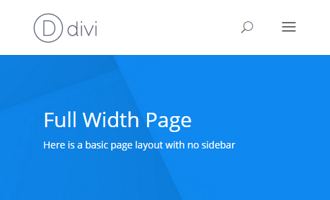
On screens 980px or smaller…
How it works A media query is made up of a media type and at least one limitation on the scope of the style sheet. In English, that simply means combining ‘@media’ with something that makes the CSS inside it, more specific. Let’s look at an example – @media ( min-width: 981px ) { #main-header { Background: #303030; } } In this example, we have used a media query that targets all devices, but only if the window is at least 981px wide. What if we wanted to target window sizes of at least 981px wide but not larger than 1100px? We would adjust the query like so… @media ( min-width: 981px ) and ( max-width: 1100px ) { You’ll sometimes see media queries for Divi expressed like this: @media only screen and ( min-width: 1100px ) and ( max-width: 1405px) { This works much the same as our first example with two exceptions: A media type has been selected (screen). It targets (only) that media type. Generally speaking you don’t need either of these additions. ‘screen’ stops styles for other media types (handheld, tv) being loaded and ‘only’ was a necessary specificity before CSS3, but not now. That’s not to say it’s a bad idea to use the ‘only screen’ version of the selector. As we know, with CSS, specificity wins, so simply having those words will be enough to override conflicting CSS without those words. Media queries are a great way of stopping your changes having a wider reach than you meant them to. Say you make some changes on desktop and don’t want them to mess up the layout of your site on mobile, you could limit the changes to devices that are larger than 980px (the point where divi changes to the mobile menu) by placing your CSS inside a query like so:
@media ( min-width: 981px ) { /** Your CSS goes here **/ }
I often use media queries on navigation items so my changes to desktop versions don’t mess up the design on mobile. Using Media Queries in harmony with Divi breakpoints Divi already uses media queries to change the way a large number of elements are displayed at different viewports. Where possible you should try and match your own media queries to those breakpoints, as this will help them merge seamlessly with movements already happening within the theme. If you have to use different breakpoints, it’s okay to do so, but remember that lots of different breakpoints gets messy. Here are the breakpoints used in Divi that you should try and stick to. For reference, you can also find this list in your course resources.
Recent Comments