How to add icons to Divi Tabs? How to add different module inside Divi Tab?
Instead of adding icons to Divi Tabs Module or looking for a way to display another module inside each tab I took a different approach and created custom tabs layout using Blurbs as tabs titles and regular Divi sections for each tab content. This way we aren’t constrained by the default Tabs Module settings and can put any modules inside each tab. How great is that? My layout scales nicely for mobile and is available for you to download. Below I’m giving a step by step instructions on how it was made.
Step 1 – Create Titles Structure
Add a standard section and set this section padding to 0. In the Advanced Tab set the CSS ID to blurb-tabs.
For the row settings – make the row fullwidth and set Custom Gutter Width to 1.
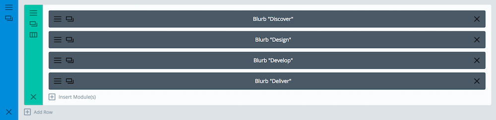
Obviously right now we have four fullwidth blurbs. It can be easily fixed with CSS flexbox. If you’d like to learn more about it – there is a fun game called Flexbox Froggy, which teaches you all the flexbox properties. Here is our CSS to fix it:
/* Style the Blurbs Tabs */
#blurb-tabs .et_pb_column {
	display:flex;
	align-items:center;
	justify-content:center;
	flex-wrap:wrap;
}
#blurb-tabs .tab-title {
	width:25%;
}
We need to use media queries to change the width of blurbs on smaller screen sizes, like this:
@media (max-width: 767px ) {
	#blurb-tabs .tab-title {
		width:50%;
	}
}
@media (max-width: 479px ) {
	#blurb-tabs .tab-title {
		width:100%;
	}
}
To use a different number of columns for tabs you’d need to adjust those width values.
In my demo layout, I’m also adding a few adjustments for the tablet and mobile view (like changing the icon size and moving the icon to the left on mobile). Here are full media queries styles for this layout:
/* Tab Titles Mobile Styles */
@media (max-width: 767px ) {
	#blurb-tabs .tab-title {
		width:50%;
	}
	#blurb-tabs .tab-title .et_pb_main_blurb_image {
		margin-bottom:10px; /* Reduce icon bottom margin */
	}
}

@media (max-width: 479px ) {
	#blurb-tabs .tab-title {
		width:100%;
	}
	#blurb-tabs .tab-title .et_pb_blurb_content { /* This moves icon to the right */
		display:flex;
		align-items:center;
		justify-content:flex-start;
	}
	#blurb-tabs .tab-title .et_pb_main_blurb_image { /* Fix icon margins on mobile */
		margin-bottom:0;
		margin-right:30px;
	}
}
This gives us nice, responsive look for blurbs, but we also use some custom CSS to create hover effects for each tab/blurb, as well as set different colours for “active” tab. Here is the code:
/* Hover Styles for Blurb Tabs - Titles */
#blurb-tabs .tab-title {
	transition:all .3s ease-in-out;
}
#blurb-tabs .tab-title:hover {
	cursor:pointer;
	background:#222; /* Tab hover background color */
}
#blurb-tabs .tab-title.active-tab {
	background:#D9DFE2; /* Active tab background color */
}
#blurb-tabs .tab-title.active-tab .et_pb_blurb_container h4 a {
	color:#000; /* Active tab title color */
}
#blurb-tabs .tab-title.active-tab .et-pb-icon {
	color:#666!important; /* Active tab icon color */
}
Step 3 – Add your content
We need four section – one for each tab. The best part of this layout is that you can put literally anything you like in each tab – as long as it fits inside a single section. I’m using an Image, Text and a Button Module in each section/tab.

Step 3 – Hide the Tabs on page load
We’ll hide the section with css, like this:
/* Hide the tabs content/sections */
.tab-content {
	display:none;
}
Step 4 – a little jQuery magic
Now – with some jQery – we’ll add an active-tab class to each Blurb Title when clicked, and show a section with the same ID as the Blurbs href attribute (URL), while making sure that other sections are being hidden. This is the working code:
jQuery(document).ready(function($) {
	/* Blurbs as Tabs */
	$('.tab-title').each(function () {
		var section_id = $(this).find("a").attr("href");
		$(this).find("a").removeAttr("href");
		$(this).click(function() {
			$(this).siblings().removeClass("active-tab");
	                $(this).addClass("active-tab");
			$('.tab-content').hide();
			$(section_id).show();
		});
	});
});
If you are not sure where to put that jQuery code – I have written some detailed instructions on how to add javascript to your Divi page. That’s it – you should be able to easily recreate this layout on your Divi website ????
Edit:
How to make one tab open on page load?
To make one of the sections visible by default you would need to add another class to this section, eg. tab-open (so it will have both: tab-content tab-open, without the comma – just the space between the two). And to make corresponding tab active the Blurb Module also needs second class active-tab (it will have both: tab-title active tab).
And then in CSS right after this:
.tab-content {
	display:none;
}
you should add:
.tab-open {
	display:block;
}
Edit #2:
How to add a smooth scroll to choosen section on tab click?
I’f you’d like your page to automatically scroll to the selected section, like on that demo page (which can be useful on mobile devices), you’d need to add this line to jQuery function:
$('html, body').animate({scrollTop: $(section_id).offset().top}, 1000);right after
$(section_id).show();so the full JS code would look like this:
jQuery(document).ready(function($) {
	/* Blurbs as Tabs */
	$('.tab-title').each(function () {
		var section_id = $(this).find("a").attr("href");
		$(this).find("a").removeAttr("href");
		$(this).click(function() {
			$(this).siblings().removeClass("active-tab");
	                $(this).addClass("active-tab");
			$('.tab-content').hide();
			$(section_id).show();
			$('html, body').animate({scrollTop: $(section_id).offset().top}, 1000);
		});
	});
});
And if you are using a fixed navigation you’d need to edit this new line of code (and replace 80 with your navigation height):
$('html, body').animate({scrollTop: $(section_id).offset().top - 80}, 1000); That’s it!